Basic Concept
UI Studio is a module to help create the UI (User Interface). It enables users to develop product pages for Policy Admin for specific products, or common UI elements shared across multiple products. By using configuration, UI can be quickly developed and changed. But it must follow certain fixed type of display style.
User Scenario
For anyone who wants to use our platform to configure an admin UI.
UI Studio Operation Guide
All operations in this text need to be done in the portal MC environment, and are not allowed in other environment unless for troubleshooting purposes.
Please make sure you have both read and write authority to make the operation beforehand.
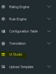
Menu to UI Studio
The menu to UI Studio is highlighted in yellow as below:
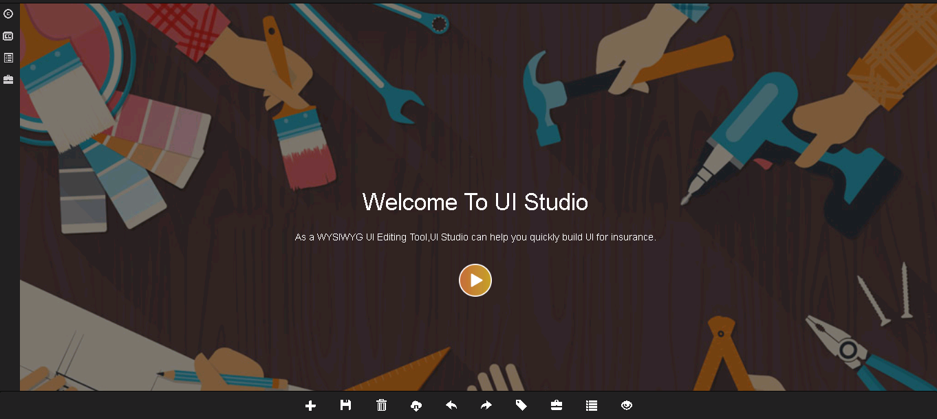
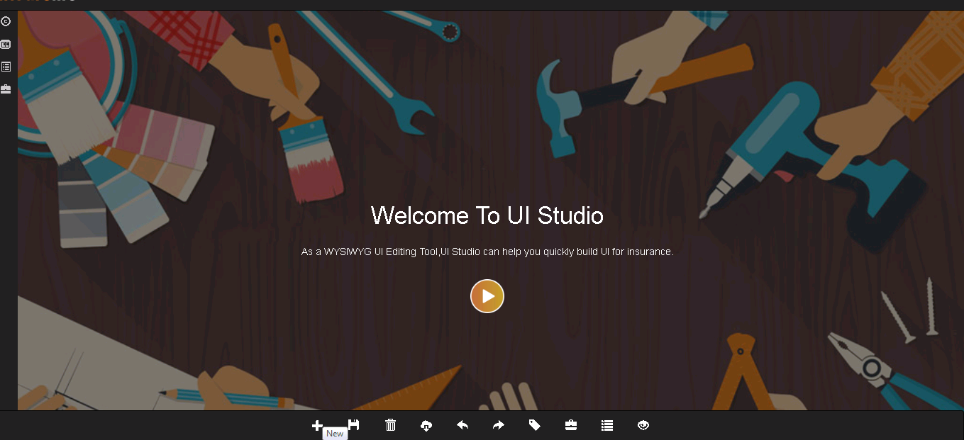
Main Page
The following is the main page of UI studio. The menus are on left side, and some function buttons are at the bottom of the main page.
Menu of UI Studio
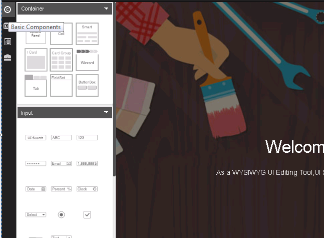
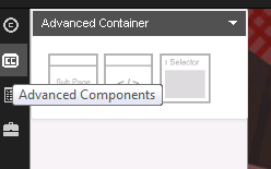
On the left side of the home page, there are 3 menus:
Basic Components
A product page is composed of various components, such as tables, tabulate, input fields and so on. Component-based thinking indicates that everything is a component, regardless of a page or a field on the page. Each component has its own lifecycle, CSS, view and logic. Components communicate with each other via dataBus.
Advanced Components
The advanced components are listed in this menu.
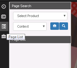
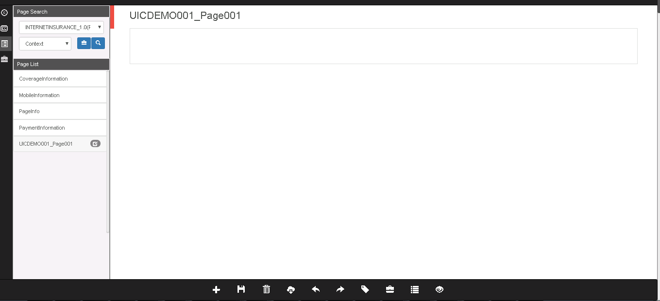
Page List
Users can find the entire product page in this menu.
Function Buttons
At the bottom of the home page, there is a list of common function buttons:

• Add: Create a new page.
• Save: Save the changes.
• Delete: Delete a page or a dialog.
• Download: Download the UI studio configuration as an excel file.
• Undo: Withdraw the last step.
• Redo: Redo the last withdrawn step.
• Tag: Users can make tags on configuring UI pages. By switching to different tags, they can switch to old versions or new versions. It’s like a history version function.
• Export: Export single page data.
• Canvas: In one product, there might be a set of pages or dialogs. By clicking Canvas, user can switch to different parts.
In the following sections, we will discuss how to use these functions through real-business examples.
Introduction to UI Components
After the new page is created, system will generate a blank drawing board. User can drag UI components to the board to configure the product interface. UI studio provides a complete set of components which fall into five main categories: Container, Button, Input, Data (Table), Dialog.
Container
Please see the online document Container.
Button
Please see the online document Main Button.
Input
Please see the online document Text Input.
Data Table
Please see the online document Data Table.
Dialog
Please see the online document Dialog.
Create a New Page - Blank
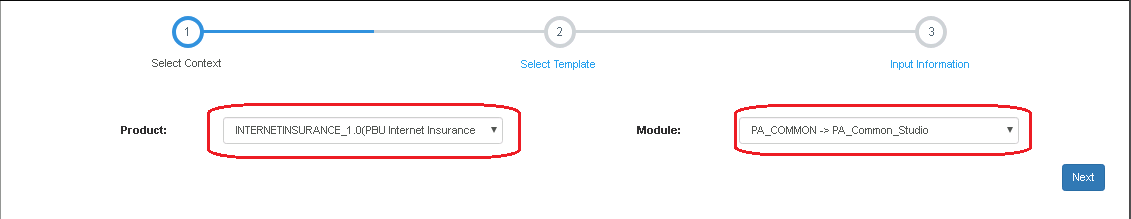
- Click New to add a new page.
- Select Context: Select Technical Product as Product, and PA Common > PA Common Studio as Module.
For market product, just choose related technical product, because system does not support pages under market product.
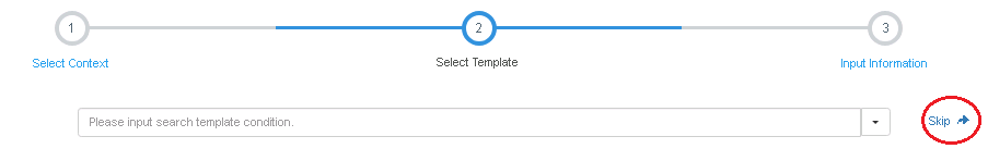
- Select Template: To create a Blank page, just click Skip.
- Input Information: Input information of the page.
- Name: User Input
- Code: System-generated
- Title: User Input
- Container: Always set as Cell.
- Model Name: Policy
- Object Code: POLICY
- Description: User Input
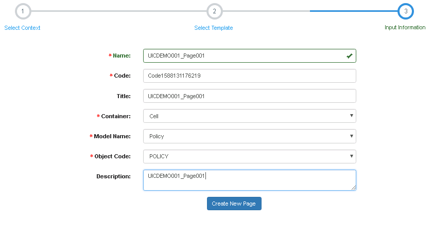
- Click Create New Page, and the blank new page will be created.
Design a Page - from Blank
Common Information
The common information is coded in UI project. They are fixed structures. UI team app developers (ADs) can code them according to the clients’ requirement.
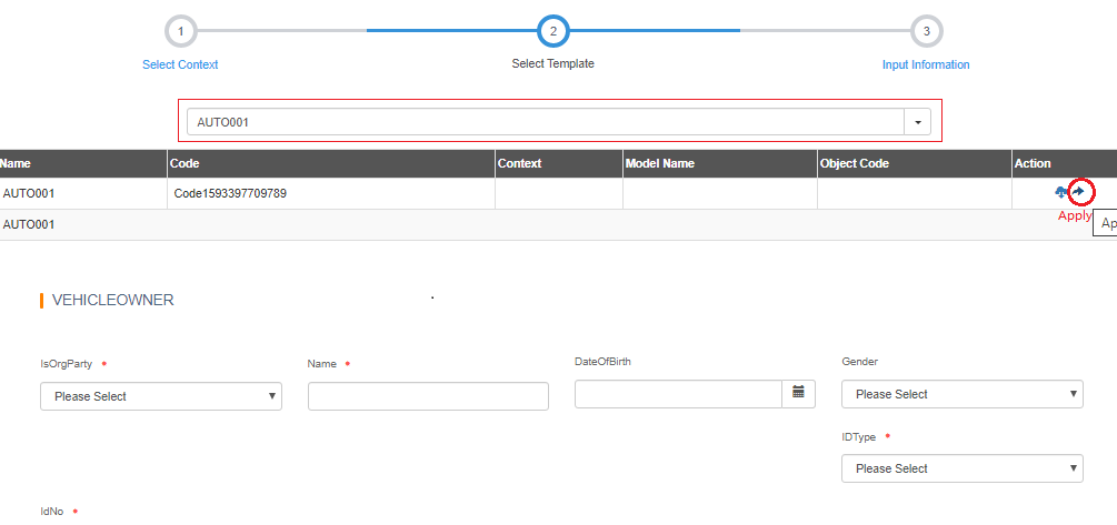
Insured/Risk Information
Before creating the Insured/Risk Information, we need to clarify the design of the Risk Information input UI.
We can get information from requirement document, the business analyst’s memo, or the Axure pages or snapshot.
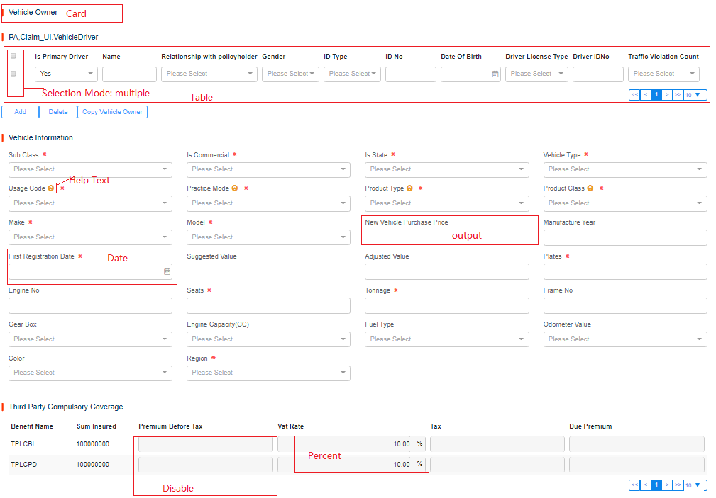
See the following figure as an example:
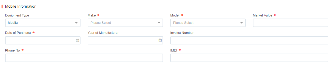
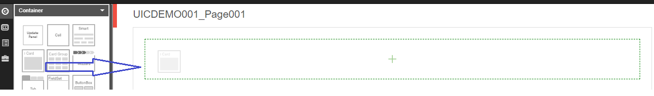
For a card and several fields, we need the components:
-
Container > Card
-
Container > Smart Panel (Drag into Card. For Input, the Smart Panel is mandatory, because it supports to set column count of each row.)
-
Input > Select /Text /Number/Date (Drag into Smart Panel)
Insured Information includes:
UI Label FieldName Component Type Code Table EquipmentType EquipmentType Select EquipmentType Make Make Select MobileMake Model Model Select MobileModel MarketValue MarketValue Number Date of Purchase DateofPurchase Date IMEI IMEI Input
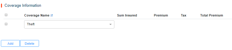
Coverage Information
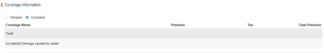
The same as the Risk Information, we need to confirm the Coverage Information input UI.
See the following scenarios as examples:
Scenario 1: All coverages are mandatory.
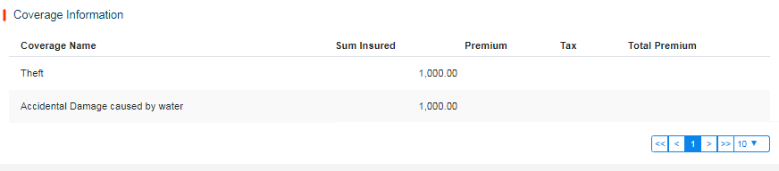
For a card or table, we need the following components:
-
Container > Card (No Smart Panel needed for Table)
-
Data > Table (No Smart Panel needed for Table)
-
Input > Select /Text /Number
Coverage Fields Information:
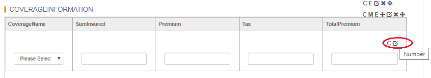
UI Label FieldName Component Type Disabled CoverageName ProductElementCode Select SumInsured SumInsured Number True Premium Beforevatpremium Number True Tax Vat Number True TotalPremium DuePremium Number True
Scenario 2: Coverages are chosen by user.
For a card or table, we need the following components:
-
Container > Card
-
Data > Table (Drag into Card)
-
Input > Select /Text /Number (Edit/Add/Delete to Table)
Coverage Fields Information:
UI Label FieldName Component Type Input/Output CoverageName ProductElementCode Select SumInsured SumInsured Number Premium Beforevatpremium Number Tax Vat Number TotalPremium DuePremium Number
Scenario 3: Coverages are chosen based on Plan.
For a card or table , we need the following components:
-
Container > Card
-
Input > Radio
-
Data > Table
-
Input > Select /Text /Number
Coverage Fields Information:
UI Label FieldName Component Type Input/Output CoverageName ProductElementCode Select SumInsured SumInsured Number Premium Beforevatpremium Number Tax Vat Number TotalPremium DuePremium Number
Create a New Page - From Template
The operation is the same as that of creating a new Blank page. The only different step is :
- Select a Template. To create a page from a existing page, choose the existing page. The page will be loaded. Click Apply.
Component Operation Guide
Common Information
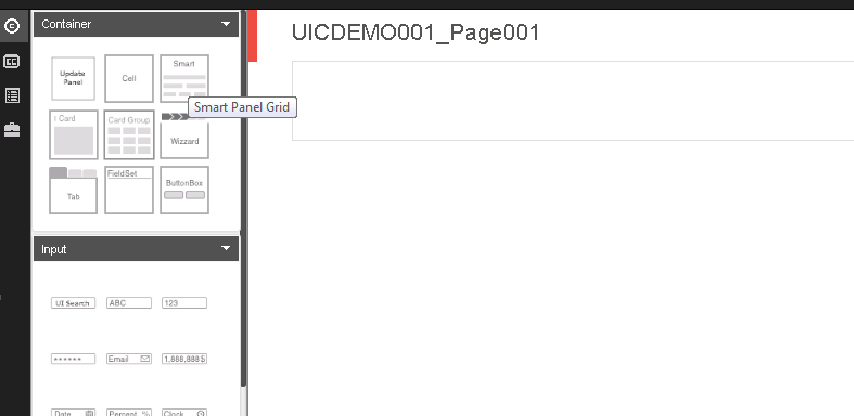
Generally, to draw a page, users need to draw its structure. That is, user should draw the containers first, and add other components inside the container by dragging from the left side.
Insured/Risk Information
Blank Page
Add Card
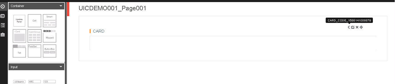
Add Smart Panel
Set Card Attributes
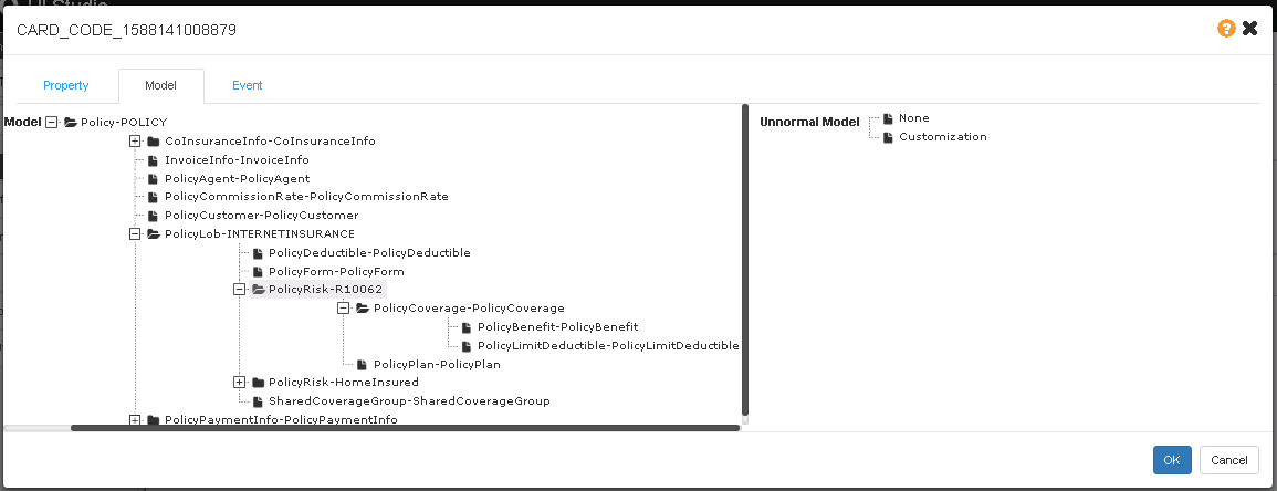
Bind Model
For most of the containers and tables (with the exception of tabs and button boxes), users need to bind a model to them.
The model structure is generated from the data dictionary of the technical product.
Set Property
- Code is generated bys system.
- Title is recommended to be set without any blank space. It will be set as the field label key in I18n.
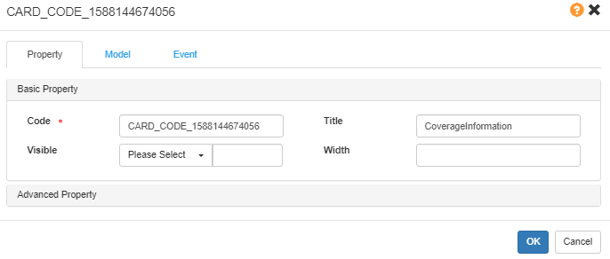
To learn more properties description, please see Rainbow UI.
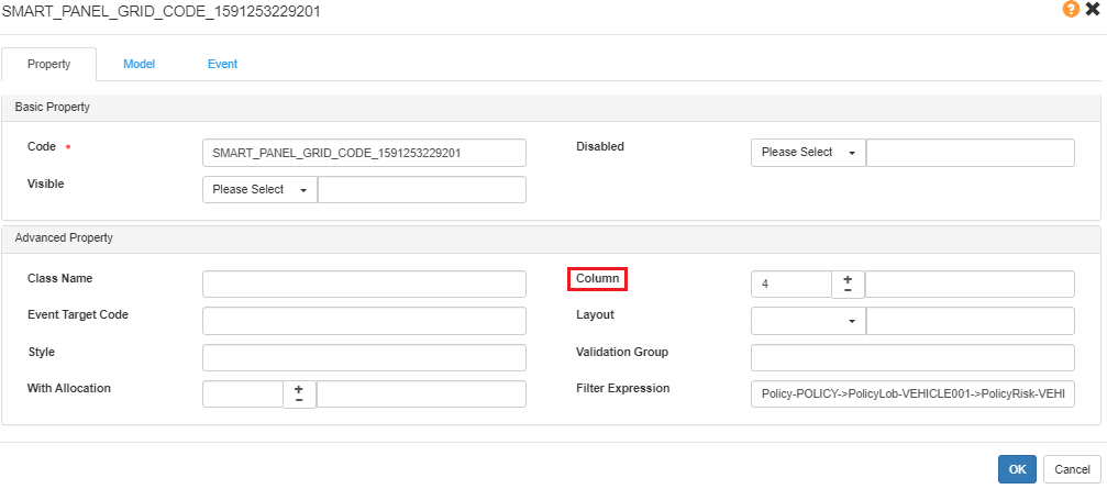
Set Smart Panel Attributes
For a smart panel, we always need to set the Column. The default page column is 2. Now, we recommend to set it as 4, which means 4 fields will show in the row.
Add Fields Input By User
Input Fields
Text
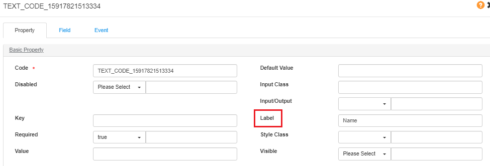
Basic Property:
- Code: System-generated.
- Label: The label in UI Studio will be the key for I18n translation.
- Default Value: The default value needs to be shown in UI.
- Disabled: By default, it’s false meaning editable while true means uneditable.
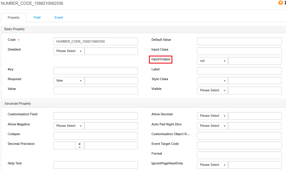
- Input/Output: By default, it’s false meaning Input by User while true means “Output”.
- Required: By default, it’s false meaning Optional while true means Mandatory.
- Visible: By default, it’s false meaning invisible in UI while true means visible.
- Value: /
For more details, please see Text Input.
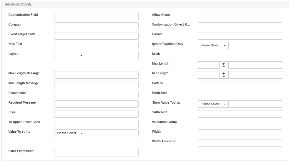
Advanced Property:
- Customization Field: /
- Allow Chars: Set the pattern of allow chars as [A-Z],[a-z],[0-9],/^[A-Za-z0-9]*$/, etc.
- Colspan: /
- Customization Object Relation: /
- Event Target Code: /
- Format: /
- Help Text: /
- IgnorePageReadOnly: /
- Layout: /
- Mask: /
- Max Length: /
- Max Length Message: /
- Min Length: /
- Min Length Message: /
- Pattern: /
- Placeholder: /
- PrefixText: /
- Required Message: /
- Show Value Tooltip: /
- Style: /
- SuffixText: /
- To Upper Lower Case: User input. you can set it to be upper/lower if needed.
- Validation Group: Self-defined. Then it can be used in UI coding project.
- Value To string: By default, it’s “false” meaning to keep original, while “true” means to convert to String.
- Width: /
- Width Allocation: /
- Filter Expression: /
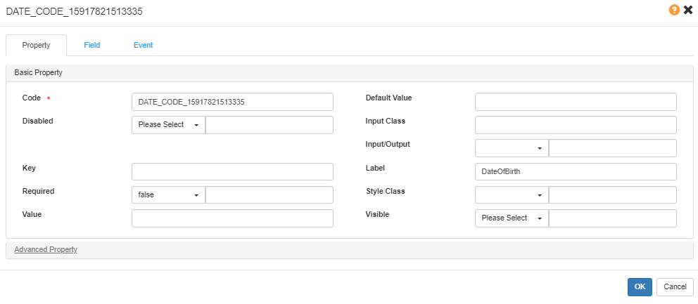
Date
Basic Property:
- Same as Text.
For more details , please refer to Date Input.
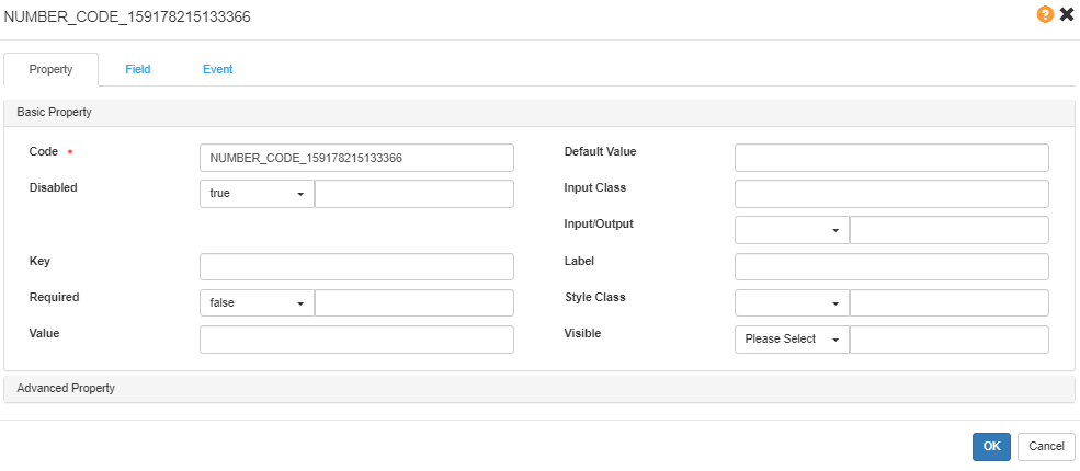
Number
Basic Property:
-
Same as Text.
For more details , please refer to Input Number.
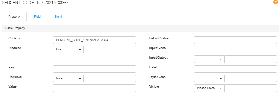
Percent
Basic Property:
- Same as Text.
For more details, please refer to Percent Input.
Select
Basic Property:
- Same as Text.
For more details , please refer to Search Input.
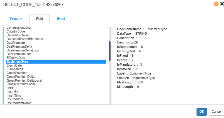
Common Setting -Field
By default, the Field list shows the field under the Model bound in Data Dictionary.
Select Cascaded
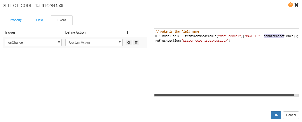
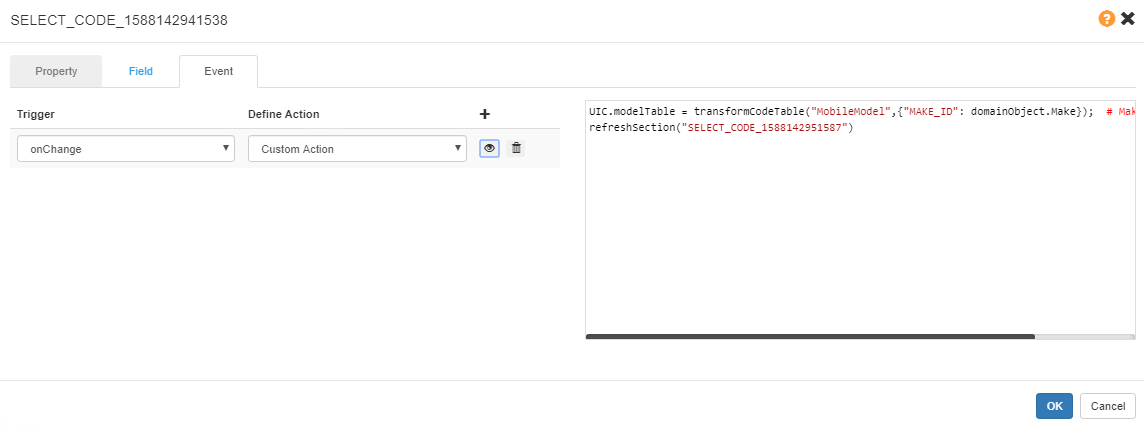
Make
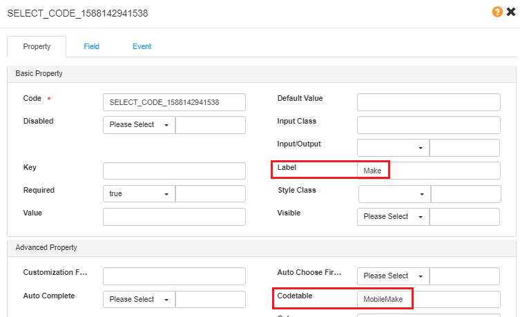
UIC.modeTable is obtained based on the value of Make as a condition. The javascript below is customized in the Make field Event.
// Make is the field name
UIC.modelTable = transformCodeTable("MobileModel",{"MAKE_ID": domainObject.Make});
// SELECT_CODE_1588142951587 is the MOdel field Code
refreshSection("SELECT_CODE_1588142951587")
The refreshed section “SELECT_CODE_1588142951587” is the dropdown list of the Model field.
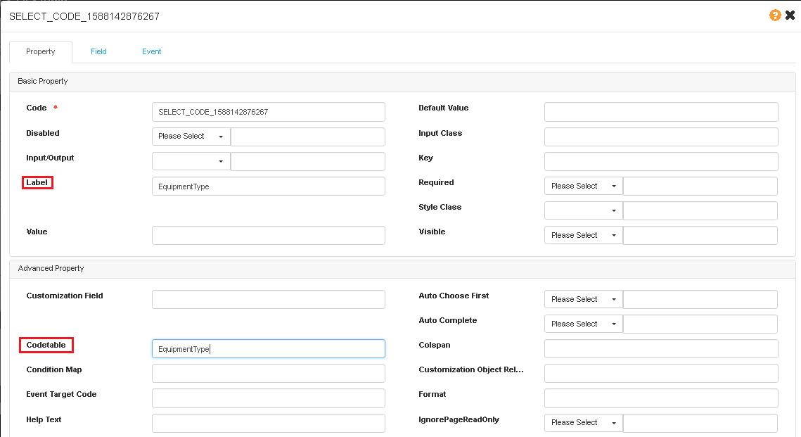
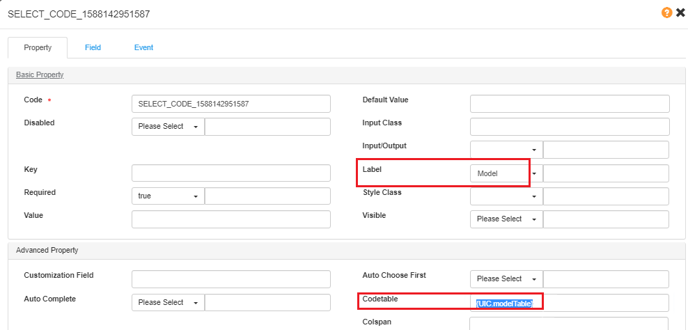
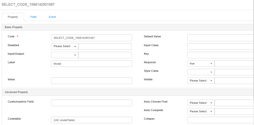
Model
Set the Codetable in the Model field.
Set Event
The Event is used to set the trigger and action of component.
For example,
- set default data records for table during page loading.
- copy data from other model.
- click the button, and the expected dialog will show up.
Event Trigger and Action
For different component types, the trigger and action may be different.
For event triggers, please refer to [Event Attributes](#Event Attributes).
For event actions:
| Action | Description |
|---|---|
| Create | Show a dialog of creating an object |
| Edit | Show a dialog of editing an object |
| Delete | To delete an object |
| Save | save the object |
| Ok | confirm the operation |
| Cancel | cancel current operation |
| Inline Create | add a row in table for creating a new record |
| Calculate | calculate the premium |
| Custom Action | coding the action |
Coverage Information
Add Table
Add a New Table
When a table is created, there will be 3 columns as Text.
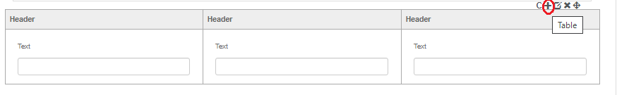
If you need to change the data type of the column or add more column, you can use + to add new columns.
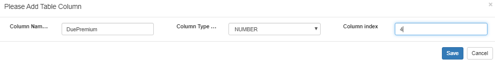
Add/Edit/Delete Column
- Column Name: self-defined
- Column Type: data type
- Column Index: column index, starting from 0. 4 means the 5th column.
Map Field to Column
By the icon for a column, you can delete or edit the column.
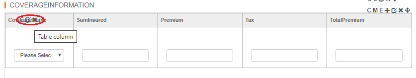
Click Edit, and you can map the field to the column. The Value of the column is the name of the field you want to map.
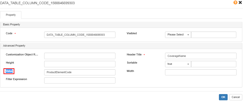
Edit Data Format
By the icon for a column data type, you can edit the data format details.
For a table column, we always define the Disabled/Input/Out/Required for a column.
Actions for a Table - Add/Delete
For a table, sometimes we need to add or delete the data record one by one.
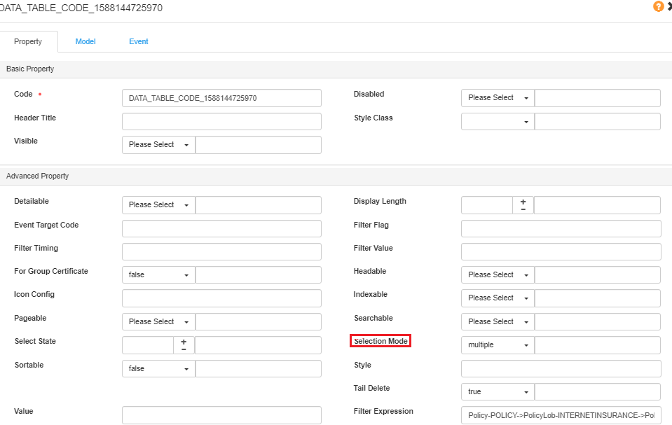
First, set the table record to be selectable (single or multiple).
Button - Add record
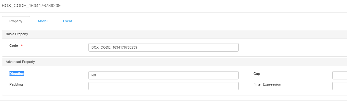
tips: Buttons are by default right aligned. If you want to change them to be left, please add a **Button Box** (Basic Components > Container > Button Box), move the buttons to the box, and set the **direction** of the box.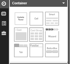
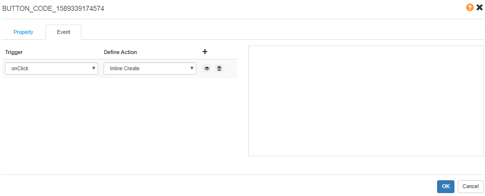
Set the targetTableCode to the code of the data table.
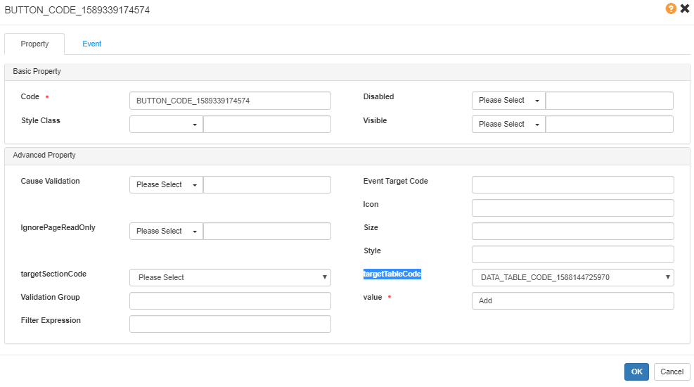
Set the event as onClick > Inline Create .
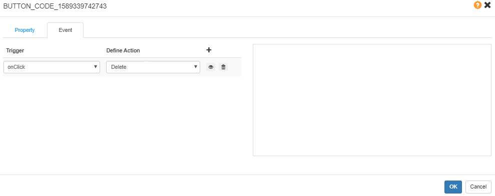
Button-Delete record
Set the targetTableCode to the code of the data table, the same as Add button.
Set the event as onClick > Delete.
Condition for Visible/Disable/Required
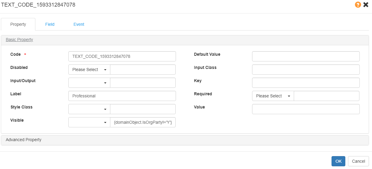
To set a component show/hide/enable/disable under the condition: {domainObject.XXX==‘value’}.
Example: {domainObject.IsOrgParty!=‘Y’}
The Profession field will show when IsOrgParty is not Yes. Otherwise it will not show.
Style Class
The Style Class options:
- Null: Blue (Default color)
- Success: Green
- Information: Purple
- Warning: Orange
- Danger: Red
- Default: White
- Disabled: Gray
Refer to Main Button.
Event for Common Scenarios
UI rule/event is for controlling the behavior of UI.
For example: pop up messages, show/hide/enable/disable components, component linkage, operate model.
Use JS + DSL method to maintain the rule script.
Event Attributes
| Trigger | Description |
|---|---|
| On Blur | Event occurs when an object loses focus. |
| On Change | Event occurs when the content of the domain changes. |
| On Focus | Event occurs when an object gets focus. |
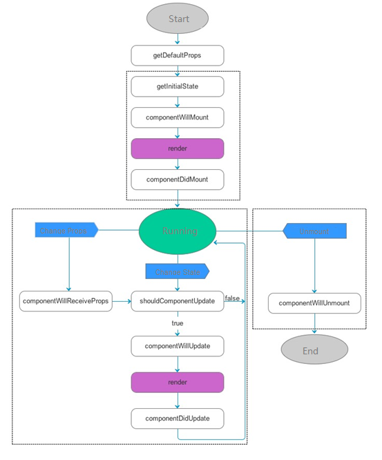
| componentwillupdate | When performing props and state changes, and performing in the previous render method before, render initialization method is not executed. Special attention should be paid to this function and you can use this.setState to modify the state. After the function call, the nextProps and nextState will be set to this.props and this.state. After this function, it will immediately call render () to update the interface. |
| componentwillmount | This method is executed only once, before the initialization of the render. If setState is called in this method, render will know that the state has changed and that it is executed only once. |
| componentdidupdate | After the component is updated, it will not execute when initializing render. |
| componentwillunmount | When the component is removed from the interface, it will call componentWillUnmount (). In this function, you can do some cleaning related components, such as the abolition of timers, network requests, etc. |
| componentdidmount | Only once after the initialization of render, you can access any component in this method, including the componentDidMount () method of sub components before the parent component. Starting with this function, you can interact with other JS frameworks, such as setting the timing setTimeout or setInterval, and initiating a network request. |
Each of the triggers is one part of the react components lifecycle. The execution sequence is as follows:
- componentwillupdate
- componentwillmount
- componentdidupdate
- componentwillunmount
- componentdidmount
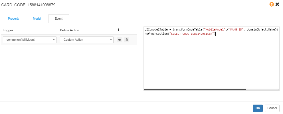
Code Table Cascade
Set Event on the parent field as onChange > Custom Action.
Take the Make and Model as an example.
When the Make selected the Model options, it will change according to the selected value of Make.
Set Event for Make. When Make changes, update the options of Model based on the Make’s selection:
// MobileModel is the codetable name for mobile model;
// {} is the codtion to filter the codetable; it is difined in DD-codetable.
// Make is the field name of Monile Make(domainObject is the current model of the container);
UIC.modelTable = transformCodeTable("MobileModel",{"MAKE_ID": domainObject.Make});

//SELECT_CODE_1588142951587 is the UIC code of the mobile model field
refreshSection("SELECT_CODE_1588142951587");
The {UIC.modelTable} defined in event will be set as the Code table of the model.
To make sure the code table function properly when loading policy, we need to copy the events for code table cascade from field to the card.
Code Table Show the Only Option
The Auto Choose First can not work for UI Studio pages currently. If you want the dropdown list to show the only option, you can set event logic as below:
    var models= = transformCodeTable("MobileModel",{"MAKE_ID": domainObject.Make});

    if(models.codes.length ==1){// if the models only 1 option, then show it
       domainObject.Model=models.codes[0].id
    }
    //SELECT_CODE_1588142951587 is the UIC code of the mobile model field
    refreshSection("SELECT_CODE_1588142951587");
Set Default Record for a Data Table
For Coverage Information, there are always plans, and different covers or sum insured based on plan.
Default Coverages Chosen
//debugger
let policyRisk = lookupModel("PolicyRisk", "VEHICLE");
if(policyRisk[0].PolicyCoverageList[0].ProductElementCode=="PolicyCoverage"){
    policyRisk[0].PolicyCoverageList.push(
      {
        "BusinessObjectId": 373684951,
        "ProductElementCode": "TPLC",
        "VatRate":0.1,
        "PolicyBenefitList": [{
          "BusinessObjectId": 373684955,
          "ProductElementCode": "TPLCBI",
          "SumInsured": "100000000",
          "VatRate":0.1
        },{
          "BusinessObjectId": 373684955,
          "ProductElementCode": "TPLCPD",
          "SumInsured": "100000000",
          "VatRate":0.1
        }]

      }
    );
  //start from 0, delete 1 cover
                policyRisk[0].PolicyCoverageList.splice(0, 1);
}
refreshSection("DATA_TABLE_CODE_1591255187778");
No Coverage Chosen Defaultly
//debugger
let policyRisk = lookupModel("PolicyRisk", "VEHICLE");
if(policyRisk[0].PolicyCoverageList[0].ProductElementCode=="PolicyCoverage"){
    policyRisk[0].PolicyCoverageList.push(
      {
      }
    );
  //start from 0, delete 1 cover
   policyRisk[0].PolicyCoverageList.splice(0, 1);
}
refreshSection("DATA_TABLE_CODE_1591255187778");
Default Plan and Coverages Setting
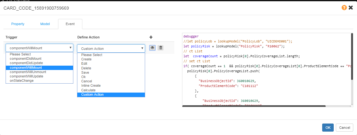
let policyRisk = lookupModel("PolicyRisk", "R10062");
if(policyRisk&&policyRisk[0]&&!policyRisk[0].PlanName){
  policyRisk[0].PlanName = "1"
  if(!policyRisk[0].PolicyCoverageList){
    policyRisk[0].PolicyCoverageList = [];
    policyRisk[0].PolicyCoverageList.push(
      {
        "BusinessObjectId": 360010629,
        "ProductElementCode": "C101112",
        "SumInsured": 1000,
      }
    )
  }
}
refreshSection("CARD_CODE_15888457324299");
Plan and Coverages
let policyRisk = lookupModel("PolicyRisk", "R10062");
if(policyRisk&&policyRisk[0]&&policyRisk[0].PlanName){
  if(!policyRisk[0].PolicyCoverageList){
    policyRisk[0].PolicyCoverageList = [];
  }
  if(policyRisk[0].PlanName == "1"){
    if(policyRisk[0].PolicyCoverageList.length == 0){
      policyRisk[0].PolicyCoverageList.push(
        {
          "BusinessObjectId": 360010629,
          "ProductElementCode": "C101112",
          "SumInsured": 1000,
        }
      )
    }else if(policyRisk[0].PolicyCoverageList.length == 2){
      policyRisk[0].PolicyCoverageList.splice(1,1)
    }
  }
  if(policyRisk[0].PlanName == "2"){
    if(policyRisk[0].PolicyCoverageList.length == 1){
      policyRisk[0].PolicyCoverageList.push(
        {
          "BusinessObjectId": 360010629,
          "ProductElementCode": "C101113",
          "SumInsured": 1000,
        }
      )
    }
  }
}
 refreshSection("DATA_TABLE_CODE_158884573243010")
Copy Data From Other Models
Copy PolicyHolder
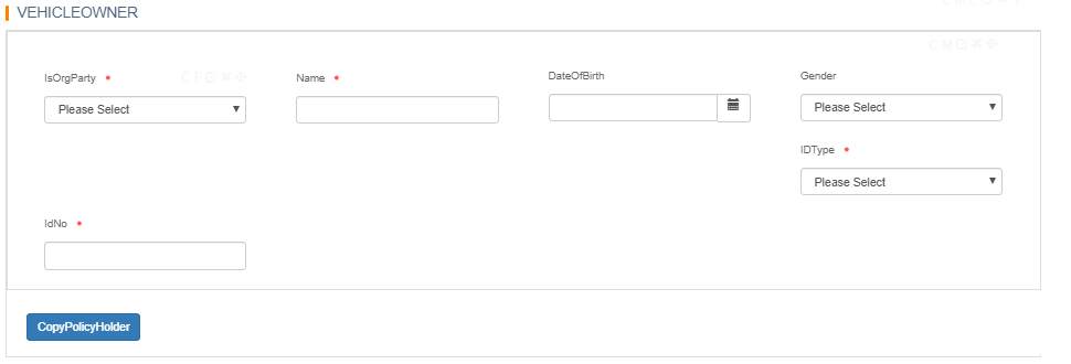
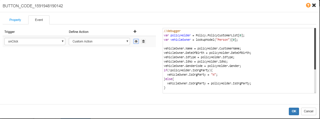
//debugger
var policyHolder = Policy.PolicyCustomerList[0];
var vehicleOwner = lookupModel("Person")[0];
vehicleOwner.Name = policyHolder.CustomerName;
vehicleOwner.DateOfBirth = policyHolder.DateOfBirth;
vehicleOwner.IdType = policyHolder.IdType;
vehicleOwner.IdNo = policyHolder.IdNo;
vehicleOwner.GenderCode = policyHolder.Gender;
if(!policyHolder.IsOrgParty){
vehicleOwner.IsOrgParty = "N";
}else{
vehicleOwner.IsOrgParty = policyHolder.IsOrgParty;
}
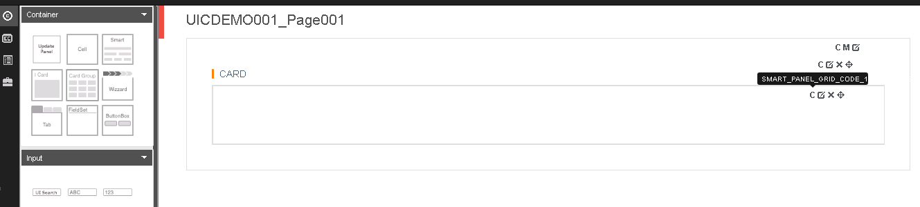
refreshSection("SMART_PANEL_GRID_CODE_15917821513332");//the smart panel for these fieldsCopy Vehicle Owner
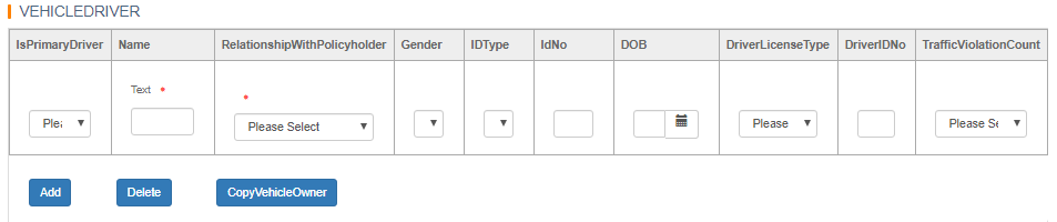
//debugger
var vehicleOwner = lookupModel("Person")[0];
var driverList = lookupModel("PolicyDriver")[0];
driverList.DriverName = vehicleOwner.Name;
driverList.DateOfBirth = vehicleOwner.DateOfBirth;
driverList.IdType = vehicleOwner.IdType;
driverList.IdNo = vehicleOwner.IdNo;
driverList.GenderCode = vehicleOwner.GenderCode;
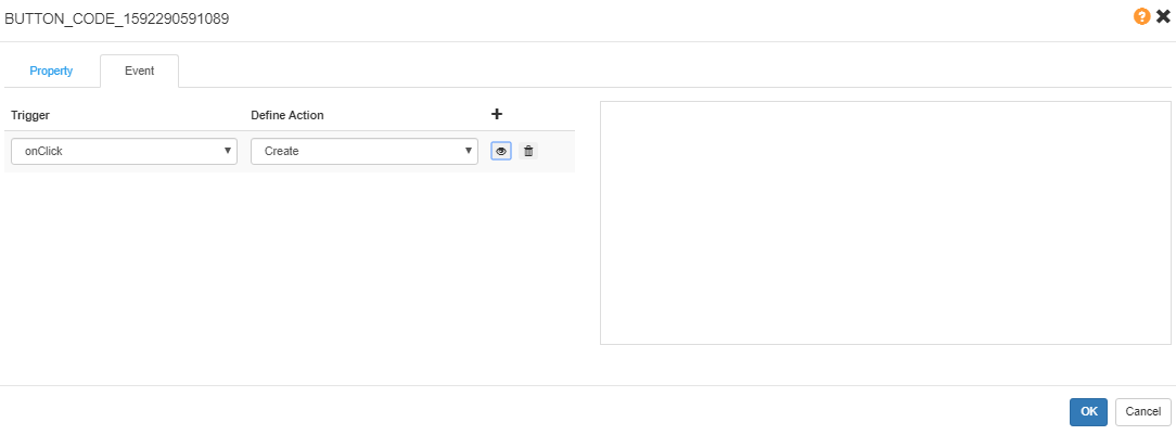
refreshSection("DATA_TABLE_CODE_1591253647317");By Clicking Button, the Expected Dialog will Show Up (NOT supported in current version, only supported in V4.2 CCIC Version).
Create a Dialog.
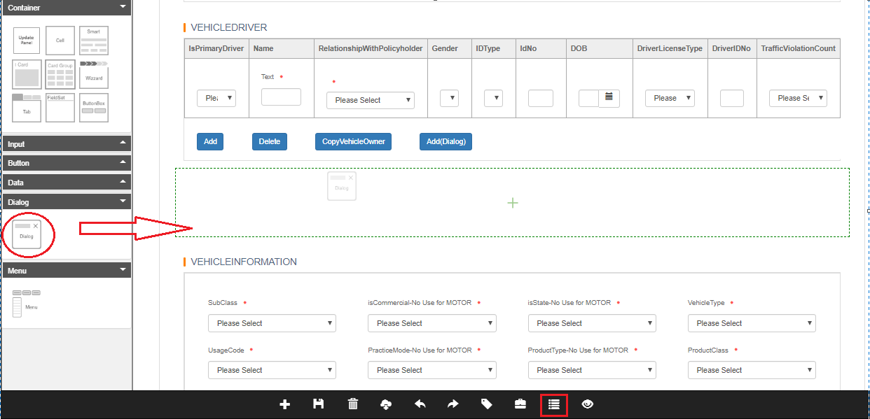
Click Canvas to open the Dialog, and edit it as a new page.
Then set the Button’s targetSectionCode to the dialog code, and set the targetTableCode to the data table code.
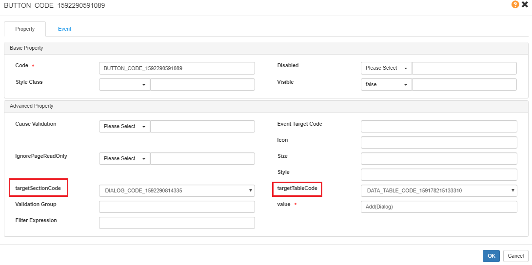
Then set the Button’s Event to be onClick > Create.
Event Debugger
In Event, here is the debugger key word.
//debugger  //OFF
debugger  //ON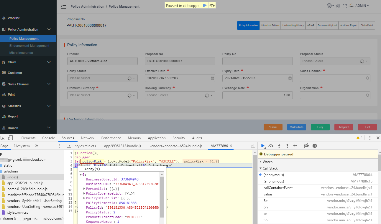
Also, we can check the data in Console.
Check the following data input:
- Policy
- UI Studio
- Global
- etc.
Tips
-
When creating a new page from an existing page, the new added page needs to set the Model.
-
When an event can not be triggered, please check whether the Model of the component is set.
-
If in CoverageInformation event, the Risk Model can not be found (lookupModel() executed failed), please check whether the Model of the risk is set.
-
If data table can not set the field value properly, check whether the UI Studio column field is set in Value.
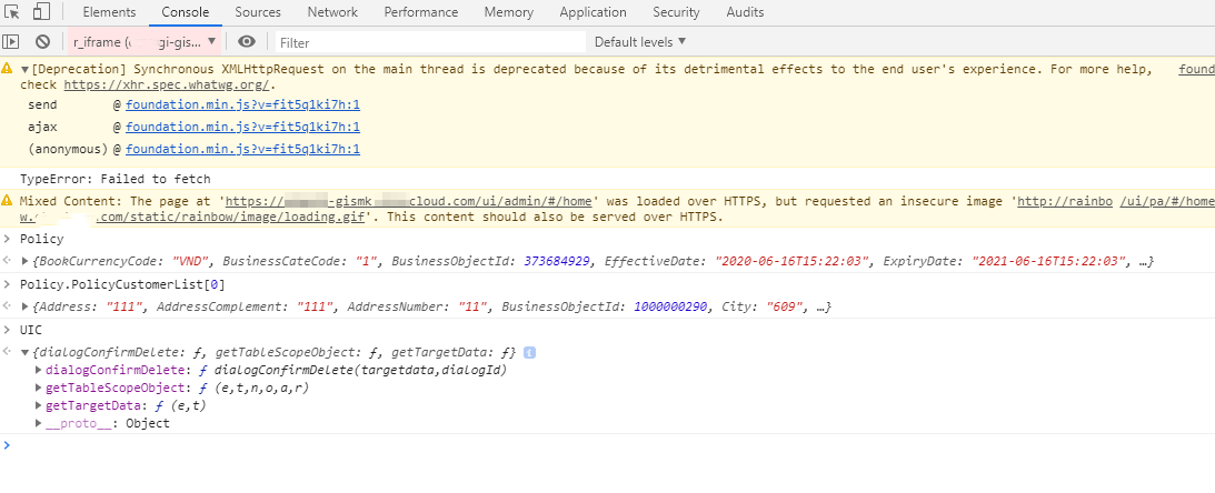
-
If console shows error as below, it is always caused by event grammar error.
 event grammar error
SyntaxError: Unexpected identifier
    at BaseContainer.callContainerEvent (vendors~endorsementManagement~policyManagements.e94ed5a3.bundle.js:1)
    at BaseContainer.value (vendors~endorsementManagement~policyManagements.e94ed5a3.bundle.js:1)
    at Be (vendor.min.js?v=yya7gasvzw:1)
    at on (vendor.min.js?v=yya7gasvzw:1)
    at cn (vendor.min.js?v=yya7gasvzw:1)
    at Tn (vendor.min.js?v=yya7gasvzw:1)
    at Sn (vendor.min.js?v=yya7gasvzw:1)
    at Un (vendor.min.js?v=yya7gasvzw:1)
    at Rn (vendor.min.js?v=yya7gasvzw:1)
Translation of the UI Studio Pages
For UI Studio pages, all the Titles of Cards and the Labels of Fields, will become the code for the fields’ codes.
For multi-language pages, we need to set the translation for the Labels.
In the Translation > UI Label, choose Module as the PA Common > PA, and Context as Common > Common .
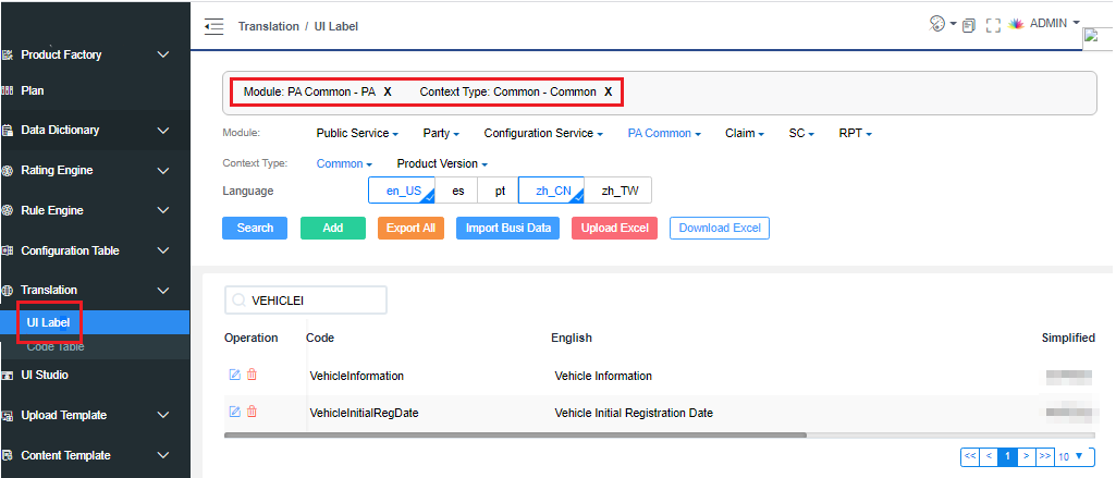
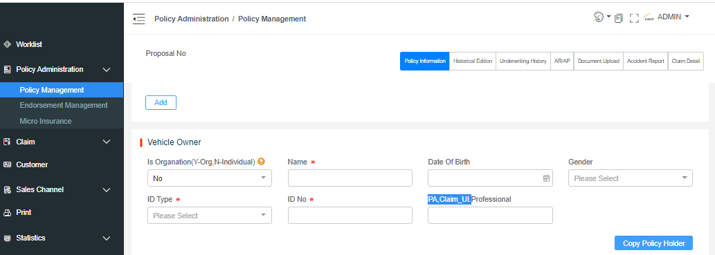
In PA pages, the field without translation will show as PA,Claim_UI.FieldCode. The FieldCode need to be set to the code of translation.
Product Related Settings
Product UI Page Setting
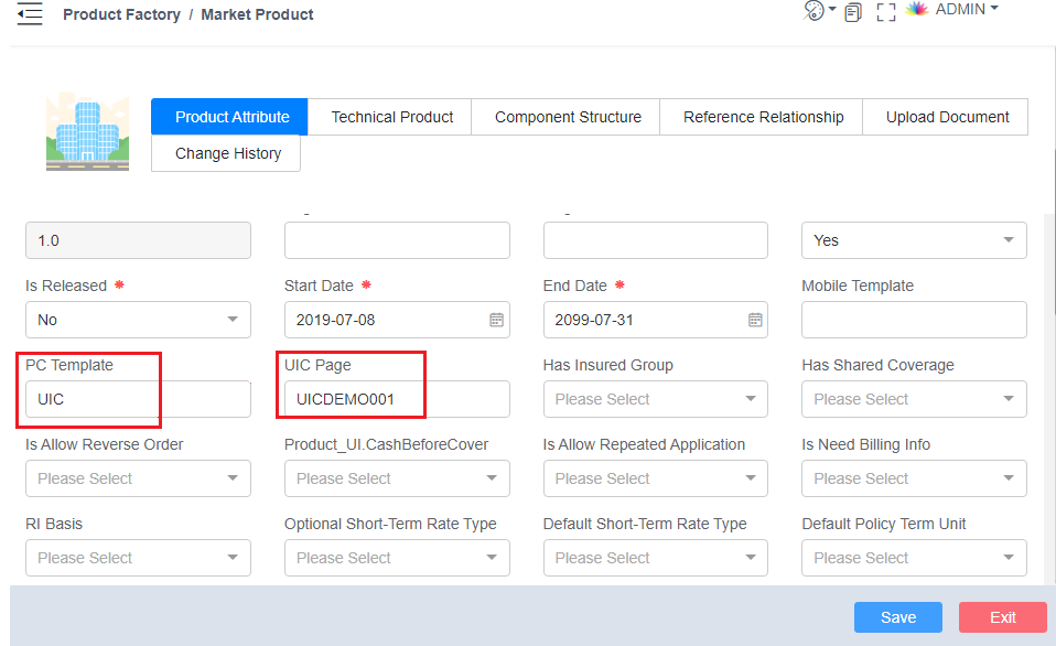
To use the configured pages in PA UI, we need to set related information in Product Attribute of Market Product. There are PC Template and UIC Page needed to be set.
- PC Template: If we need use the page in UI Studio, set it to be UIC.
- UI Studio Page: Set it to the page name in UI Studio, such as UICDEMO001_Page001. If there is more than one page, use , to separate the pages, such as INSURED, COVERAGE. And UI will show them by sequence.
Default Currency
Currently, UI project default set 3 templates for different policy default information, organizations, sales channels and customer information UIs.
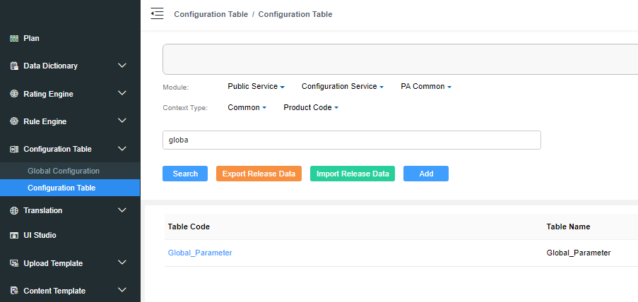
The information should be set in Configuration Table > Configuration Table > Global_Parameter.
If the configuration table does not exist or is not configured, the default template will be set to be policyinformation_US.
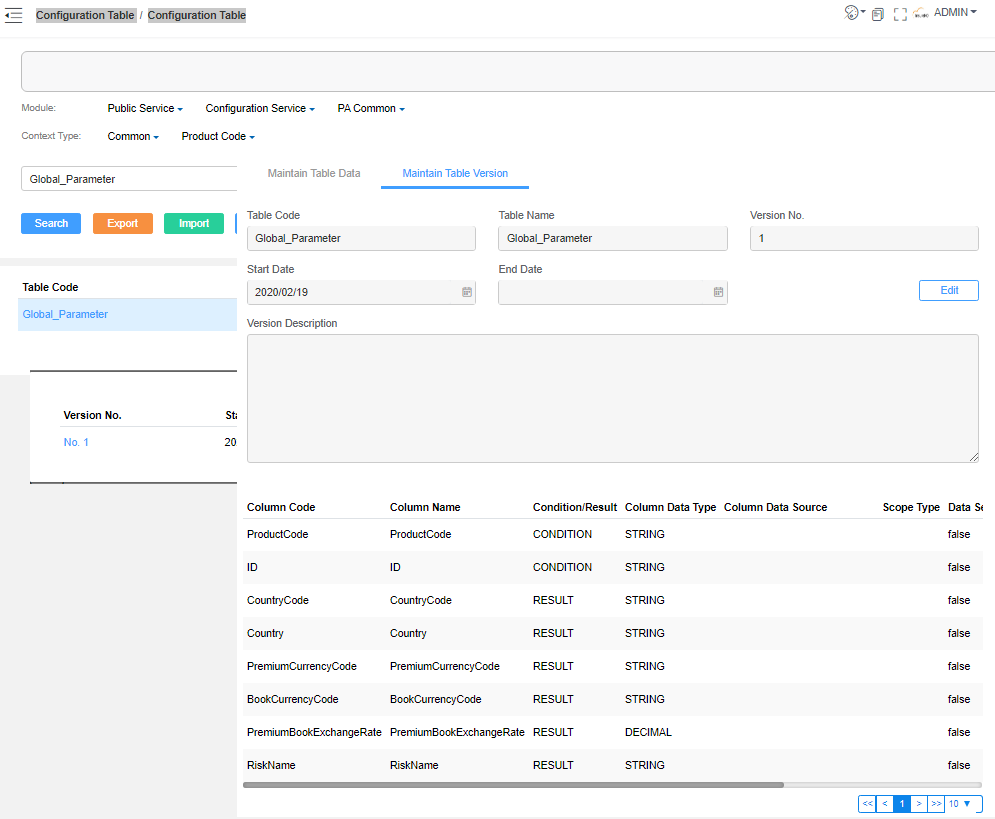
- The CountryCode define the template you choose. The PremiumCurrencyCode and BookCurrencyCode is the default currency code. The PremiumBookExchangeRate is the exchange rate between BookCurrencyCode and PremiumCurrencyCode .
- The ID is not in use now, so set it casually.
- The RiskName is defined for Claim. It is the field name to store or label the Risk. For Example, RegistationNo(Car), Adrress(Home), CustomerName(Person).
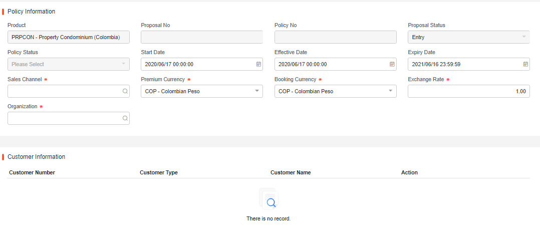
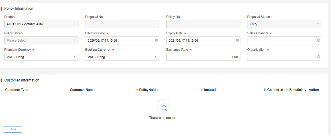
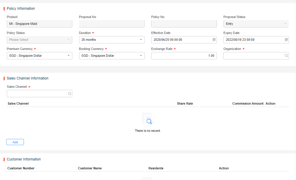
policyinformation_US:
policyinformation_BR:
policyinformation_SG:
Data Release
Export Technical Product
The UI Studio pages is under the technical product, so when we export tech product, the pages will be exported too.
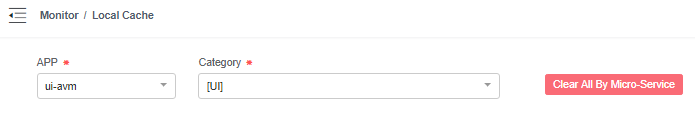
Clear AVM Cache
After the pages are deployed to the target environment, we always need to clear the service cache.
Export Translation
As the UI below, click Export All.
Clear Browser Cache
When we debug the UI Studio pages in Browser, we can find some issues of the page, and fix it. we need clear the Browser cache to reload the latest page.
Examples
UI Studio Example
The related Technical Product Code in UI Studio pages :
- INTERNETINSURANCE
- VEHICLE001
INTERNETINSURANCE
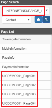
The related PA UI:
- Property > UICDEMO001
VEHICLE001
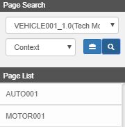
The related PA UI:
- Motor > AUTO001 , MOTOR001
PA UI Example
Reference File
See library.